The Frutiger Family History
On this site, I'll cover 2 of my favorite aesthetics and their subgenres: Frutiger Aero and Frutiger Metro!To put it short: both of these aesthetics emerged in the early 2000s and were popularized by internet culture and corporate design, and lasted until around 2010s. Both made their return in 2022, due to old aesthetics being popularized again, which caused many of their fans to devote their love to it, like I am right now!
The basics
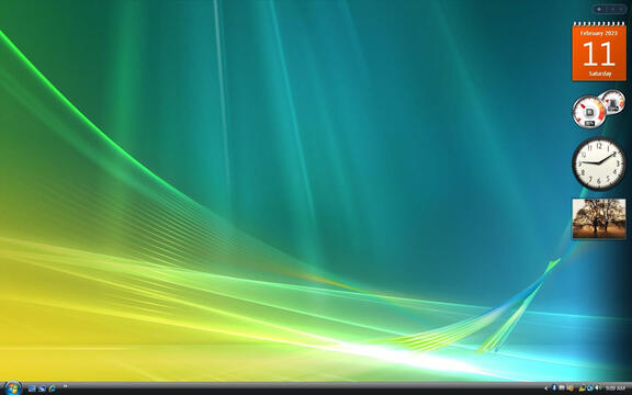
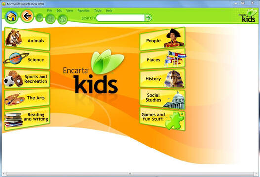
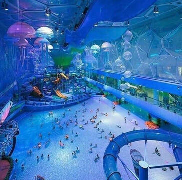
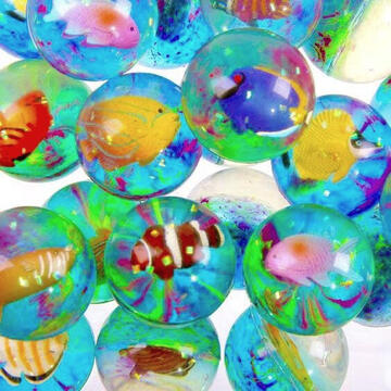
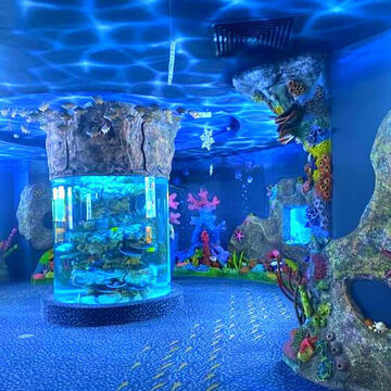
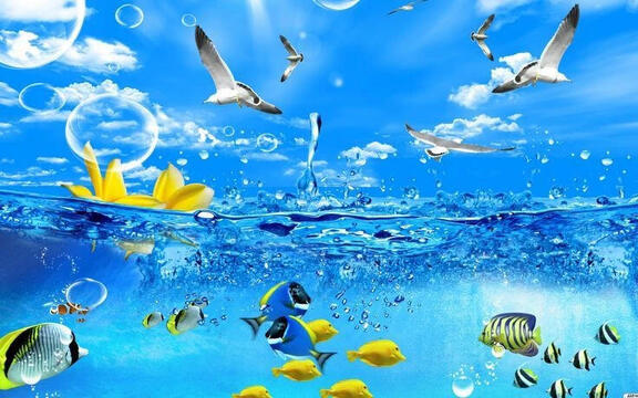
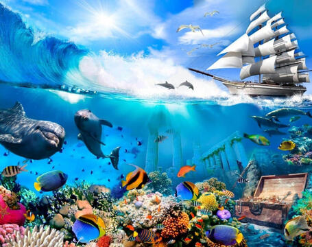
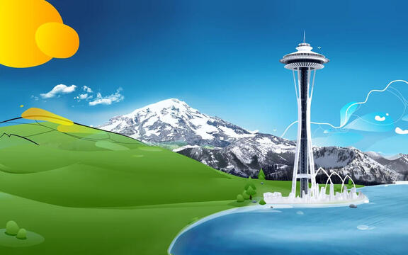
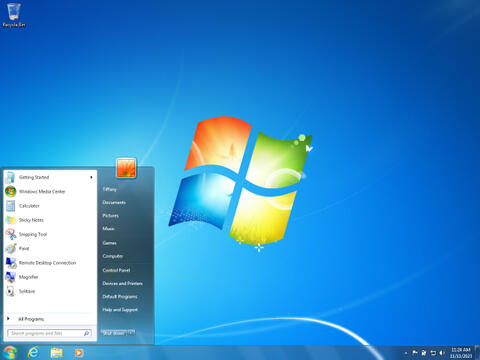
Frutiger Aero emerged from 2004 to 2005, popularized by operating systems like Windows Vista and Windows 7, and lasted until around 2011 to 2013. The key motifs of Frutiger Aero include smooth curved lines, gradients, glossy effects, harmony with nature and sea life, vibrant colors (most common used are blue, green and white) futurism and the early web.
ㅤ
ㅤ
Early Origins (2001–2004)
Named after Adrian Frutiger (1928-2015), the roots of Frutiger Aero can be traced back to 2001 with the launch of Microsoft's Windows XP and Apple's Mac OS X 10.0. Around this time, Microsoft began working on Windows Longhorn (eventually released as Windows Vista), gradually incorporating features that would later define the Windows Aero theme, which later on caused Frutiger Aero to go mainstream from around 2004 to 2007.
ㅤ
ㅤ
Peak of Frutiger Aero (2007–2012)
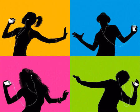
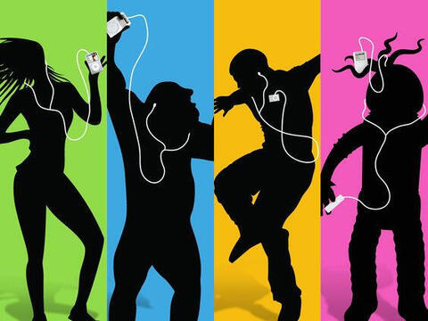
Many video game consoles, such as the Nintendo DS and PlayStation Portable, adopted this aesthetic. It was also featured in Apple's iconic iPod 'Silhouette' advertisement. Eventually, Frutiger Aero reached its peak between 2007 and 2012, heavily influencing media, stock imagery, and technology of the era. During this period, the aesthetic gave rise to numerous subgenres, examples of which are shown below.
ㅤ
ㅤ
The decline (2012–present)
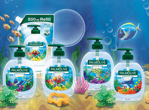
Sadly, Frutiger Aero gradually began to fade in favor of Flat Design. However, traces of Frutiger Aero can still be found today in areas like cleaning product packaging, mostly detergents, and other things like school textbooks. It also helps the fact that the aesthetic has blown in popularity from 2022 to the present, which I hope will bring its revival.
ㅤ
ㅤ
Picture examples
Main examples of UI and design examples used in softwares, operating systems and browsers. Click on the pictures to enlarge them.
The basics
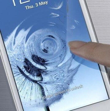
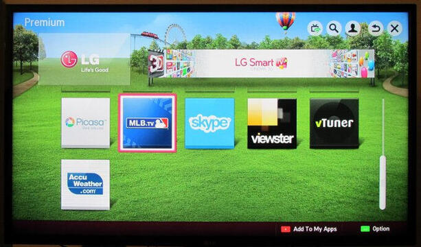
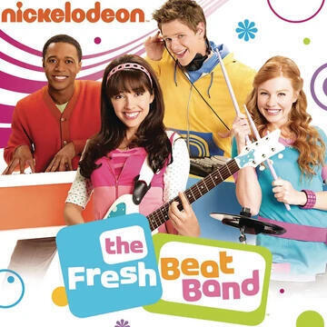
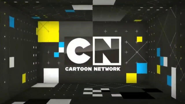
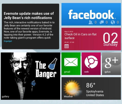
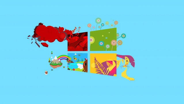
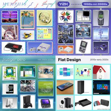
Frutiger Metro emerged in the 2000s, combining glossy textures, abstract flourishes, humanist elements, and nature-inspired motifs for its design. It blends flat, minimalist graphics with a more maximalist approach. It was mainly created to pander towards pre-teens and teenagers, which can be seen in various video game covers or commercials.
ㅤ
ㅤ
Early Origins (Early/Mid-2000s)
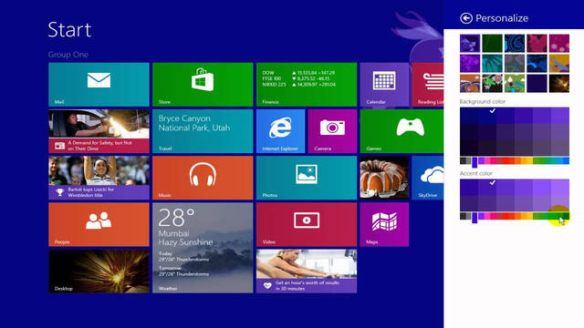
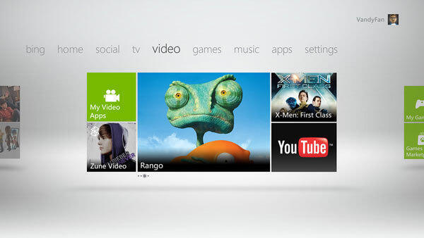
Frutiger Metro is named after "Frutiger" Aero, with the "Metro" part inspired by Microsoft's Metro design language used in Windows 8, where it was most notably featured. Similar to how Frutiger Aero was named after Windows Aero in Windows 7, Frutiger Metro was initially considered a subgenre of Frutiger Aero. However, its broader style has set it apart, making it a distinct aesthetic on its own.
ㅤ
ㅤ
Peak of Frutiger Metro (2007–2012)
The peak of Frutiger Metro started around 2004 and lasted until the early 2010s, often alongside Frutiger Aero. It gained attraction in corporate design and internet culture, giving rise to numerous variations and sub aesthetics due to its broad appeal and was widely adopted across media, everyday life, internet culture, and corporate design.
ㅤ
ㅤ
The decline (2012–2017)
Sadly, its decline started around 2012, where Frutiger Metro started becoming a more slimmed down version of itself, called Frutiger Flat or Flat Metro. By 2017, Flat Design and Corporate Memphis had become fully established, marking the decline of Frutiger Metro and the end of the Frutiger Family's mainstream popularity.
ㅤ
ㅤ
Picture examples
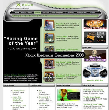
Main examples used in various internet cultures and corporate designs. Click on the pictures to enlarge them.
Frutiger Aero Subgenres
Frutiger Aero has a wide range of distinct and visually captivating subgenres, each with its own unique style while still incorporating the signature motifs that define the Aero aesthetic! These subgenres showcase the variety and creativity of Frutiger Aero's influence, with some of the most popular examples including Skeuomorphism, Frutiger Eco, Frutiger Aurora, and Helvetica Aqua Aero, each offering a fresh and imaginative take on the core design principles.
Frutiger Metro Subgenres
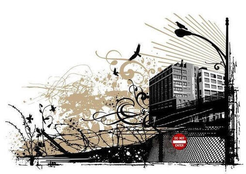
Frutiger Metro has a bold and dynamic range of subgenres, each with its own distinct flavor, while still staying true to the elements that define the Metro aesthetic! Some of the most popular subgenres include Vectorgarden (formerly known as Floral Metro), Funky Metro, Rave Metro, and Grungy Metro, each offering a unique interpretation of the Metro design principles, from vibrant and playful to raw and gritty.
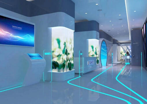
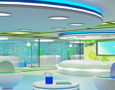
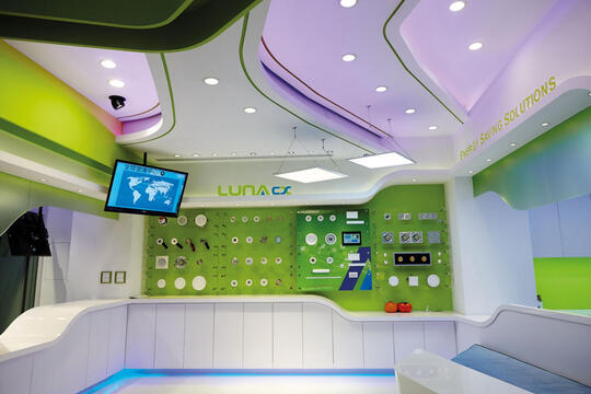
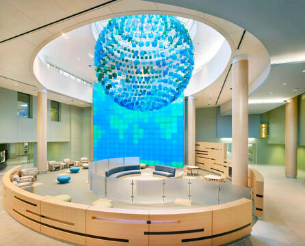
Frutiger Interior
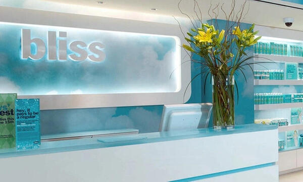
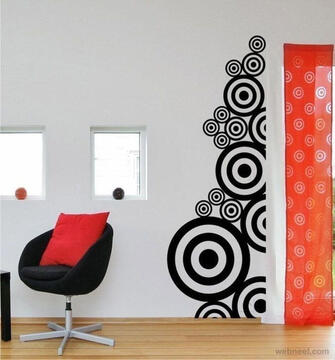
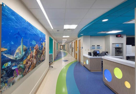
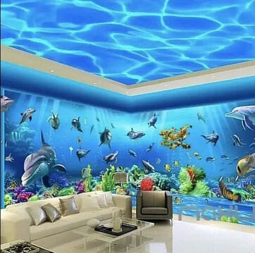
This subgenre's key value is humanism and futurism. The most common colors used in it are white, blue and green.
ㅤ
ㅤ
Frutiger Aurora
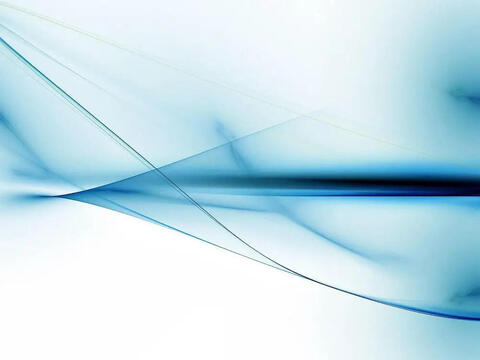
Aurora emerged in the early 2000s, and is mainly known as default wallpaper for Operating systems.
ㅤ
ㅤ
Helvetica Aqua Aero
This one is very similar to Frutiger Aero when it comes to its use of aqua life, bubbles, gloss, futurism, 3d objects and so on.
Funky Metro
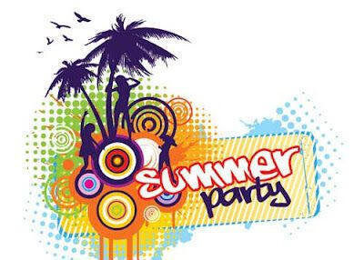
The most common subgenre when it comes to this aesthetic, because music and partying are the most defining themes of it.
ㅤ
ㅤ
Vectorflourish (Floral Metro)
Characterized by minimalist abstract flourish patterns, butterflies, flowers, gradients, bubbles, and glossy textures.
ㅤ
ㅤ
Flat Metro
Categorized by blocks of flat color, monochromatic backgrounds, simple patterns, and organic or geometric shapes.
Y2K and Frutiger Aero
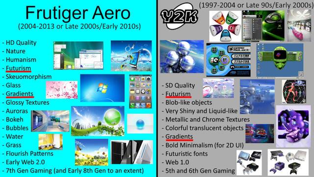
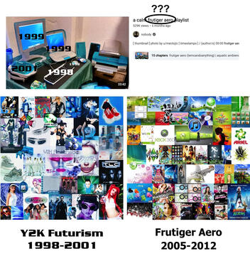
I often see people mixing up Y2K with Frutiger Aero, which is understandable since these two aesthetics share similar features, like glossy textures, gradients, and a futuristic vibe. However, Y2K tends to focus more on blob-like shapes, whereas Frutiger Aero emphasizes smooth, curved lines. Additionally, Y2K incorporates metallic and chrome textures, which Frutiger Aero does not.
ㅤ
ㅤ
Windows 7 and Windows 95
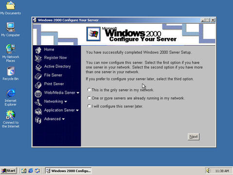
Another common mix-up is between Frutiger Aero and Windows 95. This confusion likely arises because Frutiger Aero's early designs were inspired by operating systems like Windows Vista and Windows 7. However, Windows 95 has a completely different design and should be categorized separately. For comparison, consider Windows 7 and Windows 95: Windows 7 features smooth rounded corners, vibrant colors and gradients in its UI, while Windows 95 uses a simple blue-and-gray color scheme with rectangular buttons.
ㅤ
ㅤ
Miscellaneous Misconceptions
I've also seen people often putting characters, mostly Hatsune Miku, who is rooted in anime culture and character design, while Frutiger Aero is more focused on functional, polished, and corporate design. They are vastly different from each other and don't go together. However, I've seen talented artists create their own designs for Hatsune Miku where she embodies the aesthetics of both Metro and Aero!
ㅤ
ㅤ
Conclusion
I don't want to come off that I'm attacking people for misunderstanding the aesthetic, it's normal to mistake an aesthetic for another if they look similar! I'd just be more than happy to educate people on how to differ them! While Frutiger Aero can just be about blue water, green grass, white reflections, and random bubbles thrown on objects, it’s also a beautifully stylized aesthetic that deserves to be appreciated for its thoughtful design and charm. :)
ㅤ
ㅤ
Picture examples
Some picture examples that can help you differ these aesthetics. Click on the pictures to enlarge them.
Wiki pages used for picture examples of Aero & Metro
https://aesthetics.fandom.com/wiki/Frutiger_Aerohttps://aesthetics.fandom.com/wiki/Frutiger_Metrohttps://aesthetics.fandom.com/wiki/Frutiger_Aurorahttps://aesthetics.fandom.com/wiki/Vectorflourishhttps://aesthetics.fandom.com/wiki/Frutiger_Ecohttps://aesthetics.fandom.com/wiki/HelveticaAquaAerohttps://aesthetics.fandom.com/wiki/Frutiger_Metrohttps://aesthetics.fandom.com/wiki/Flat_Designhttps://aesthetics.fandom.com/wiki/Bright_Tertiaries
ㅤ
ㅤ
Images used in mischaracterization
https://www.reddit.com/r/FrutigerAero/comments/zmz11ohttps://www.reddit.com/r/FrutigerAero/comments/1b5k888https://www.reddit.com/r/FrutigerAero/comments/1ippsot
ㅤ
ㅤ
Check out these cool sites that inspired me to make this
https://frutigeraeroarchive.org/https://frutiger-aero.neocities.org/https://frutiger-aero.org/https://frutiger-aero.org/frutiger-metrohttps://skeuoss.net/blogs/aesthetics/frutiger-metro
ㅤ
ㅤ
Aero & Metro mixes I absolutely recommend you to listen to
https://youtu.be/Xq7dRvnmqcQ?si=fqm0197GcAkM0xDnhttps://youtu.be/oUXL8p0DgJ0?si=Q2l_xkTWrf0Mj51ohttps://youtu.be/_eIlvNJNIJ8?si=2r85s91kj6LX3al8
ㅤ
ㅤ
Link to my personal website
https://deviousgiggler.carrd.co/
